Hey Bill;
Appreciate your response!
Here's what's been tried:
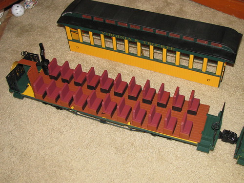
1. statred with PollyScale CNW green - looked like closest to deep grren on letterboards.
too blue
2. mixed pullman green
not right, still too blue
3. okay - think back to art classes - blue and orange complimentary colors - add one to other and will grey it out, or brown it out, or just plian cancel it out.
ahh. . . what have I got?
! Seaboard Air Line orange
4. maybe got too much, too yellow.
maybe pigment too strong?
5. well, huh . . . add coach green instead?
still not right
6. I used to be really good at this - what's happened
Appreciate your response!
Here's what's been tried:
1. statred with PollyScale CNW green - looked like closest to deep grren on letterboards.
too blue
2. mixed pullman green
not right, still too blue
3. okay - think back to art classes - blue and orange complimentary colors - add one to other and will grey it out, or brown it out, or just plian cancel it out.
ahh. . . what have I got?
! Seaboard Air Line orange
4. maybe got too much, too yellow.
maybe pigment too strong?
5. well, huh . . . add coach green instead?
still not right
6. I used to be really good at this - what's happened

 yeah, didn't ever say!


 }
}
